
MoveApp is a groundbreaking mobile application that reimagines the way people approach the challenging task of moving. Designed with user-centric principles in mind, this project aimed to streamline the relocation process, making it both cost-effective and hassle-free through the power of smart bidding.
The Problem
Moving to a new home is often a stressful and time-consuming process. Individuals and families face challenges in finding reliable moving services that align with their specific needs, such as availability on a particular moving date, the type of items to be moved, and budget constraints. The lack of a streamlined, user-friendly platform to compare and book moving services leads to frustration, inefficiency, and increased anxiety during an already hectic time.
The Solution
The app addresses this problem by providing a seamless and intuitive platform where users can easily find and book moving services tailored to their unique requirements. By inputting their moving date, location, and specific needs, users are presented with a curated list of available moving companies, complete with transparent pricing, customer reviews, and service options. The app simplifies the entire process, offering users peace of mind and efficiency as they prepare for their move.
The Logo
The logo is a thoughtful blend of visual elements and color that embody the app's purpose and brand identity. The name "MoveApp" is a clever play on words, representing both the action of moving and the concept of progression or "moving up," which aligns with the app's mission to make the moving process smoother and more efficient.
The color green was chosen for its modern, refreshing appeal, symbolizing new beginnings and growth - key themes for individuals and families embarking on a move to a new home. Green also conveys a sense of calm and balance, counteracting the stress often associated with moving.
To visually reinforce the app’s functionality, the logo features a moving truck icon. This truck includes a box with an arrow pointing upwards, signifying both the physical act of moving items and the upward momentum that the app facilitates in users' lives. The addition of speed lines around the truck further emphasizes the app's focus on efficiency and speed, ensuring a hassle-free experience for users.
Overall, the logo is a harmonious blend of symbolism and aesthetics, designed to resonate with the app's target audience while clearly communicating the brand's core values and services.
The Design Process
With the user’s needs in mind, I developed user flows that prioritize ease of use from both prespectives- the consumer and the vendor.
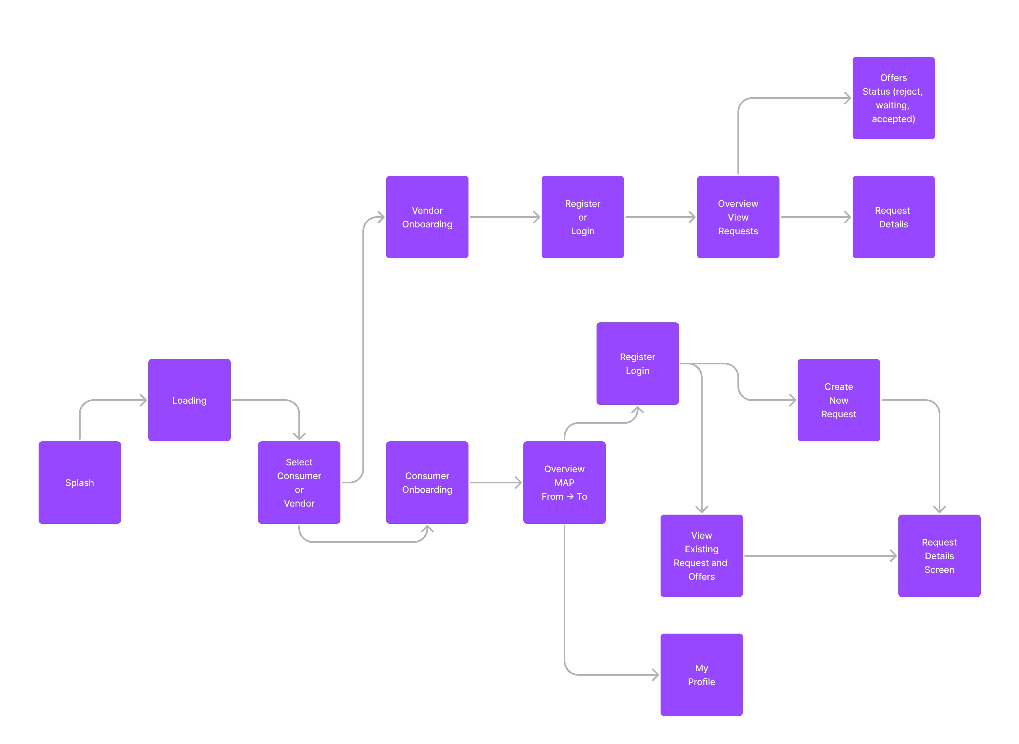
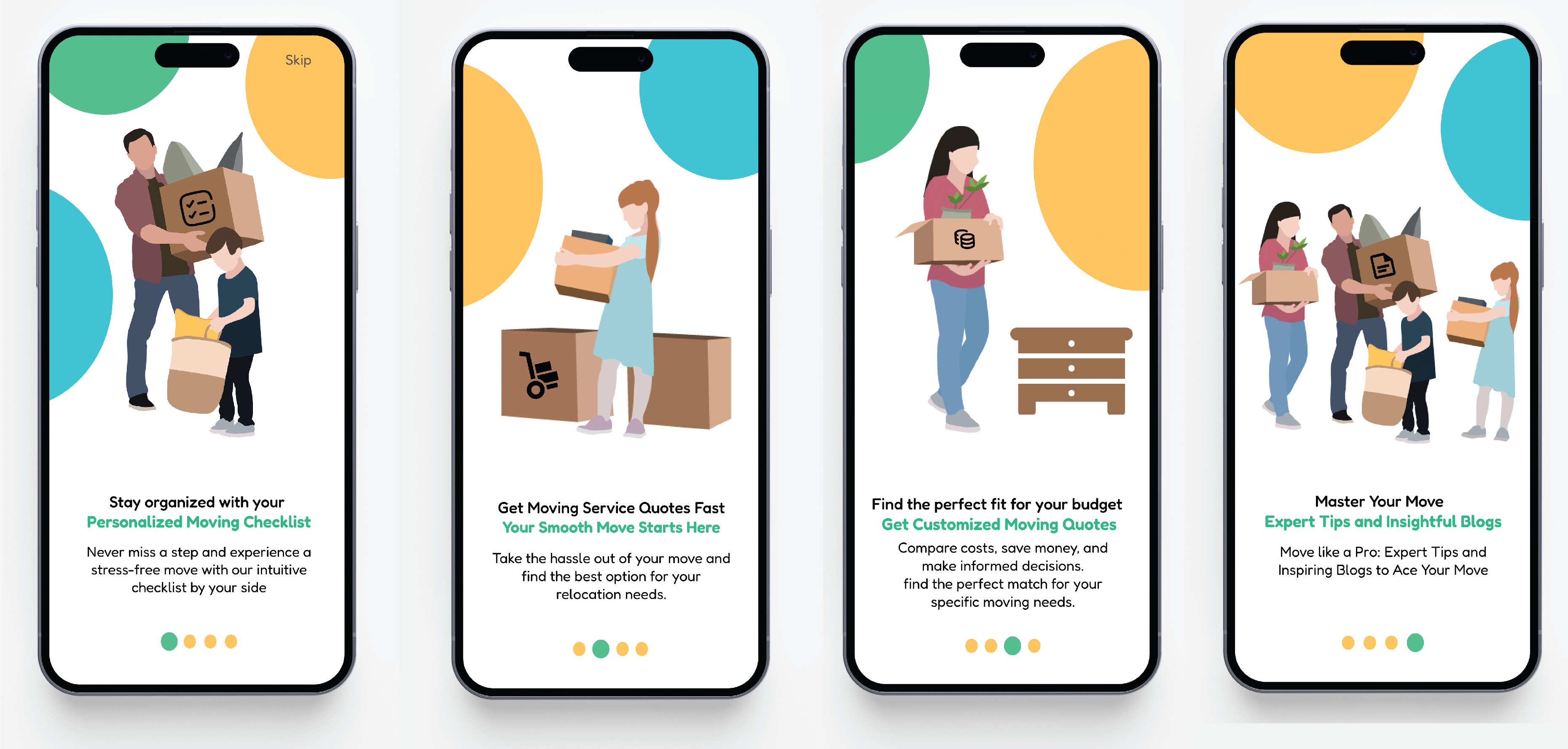
The primary focus of the app design from the movers perspective was to create an intuitive, user-friendly experience that simplifies the often overwhelming process of finding and booking a moving service.
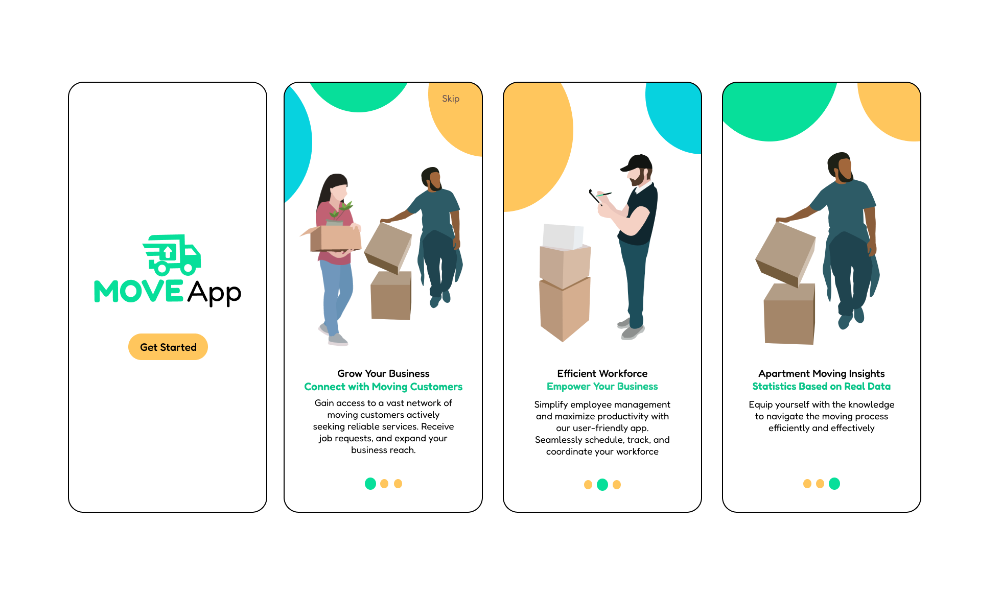
From the vendors perspective, the app design was centered on providing a platform that allows moving companies to efficiently manage their services, reach potential clients, and grow their business.
The Design
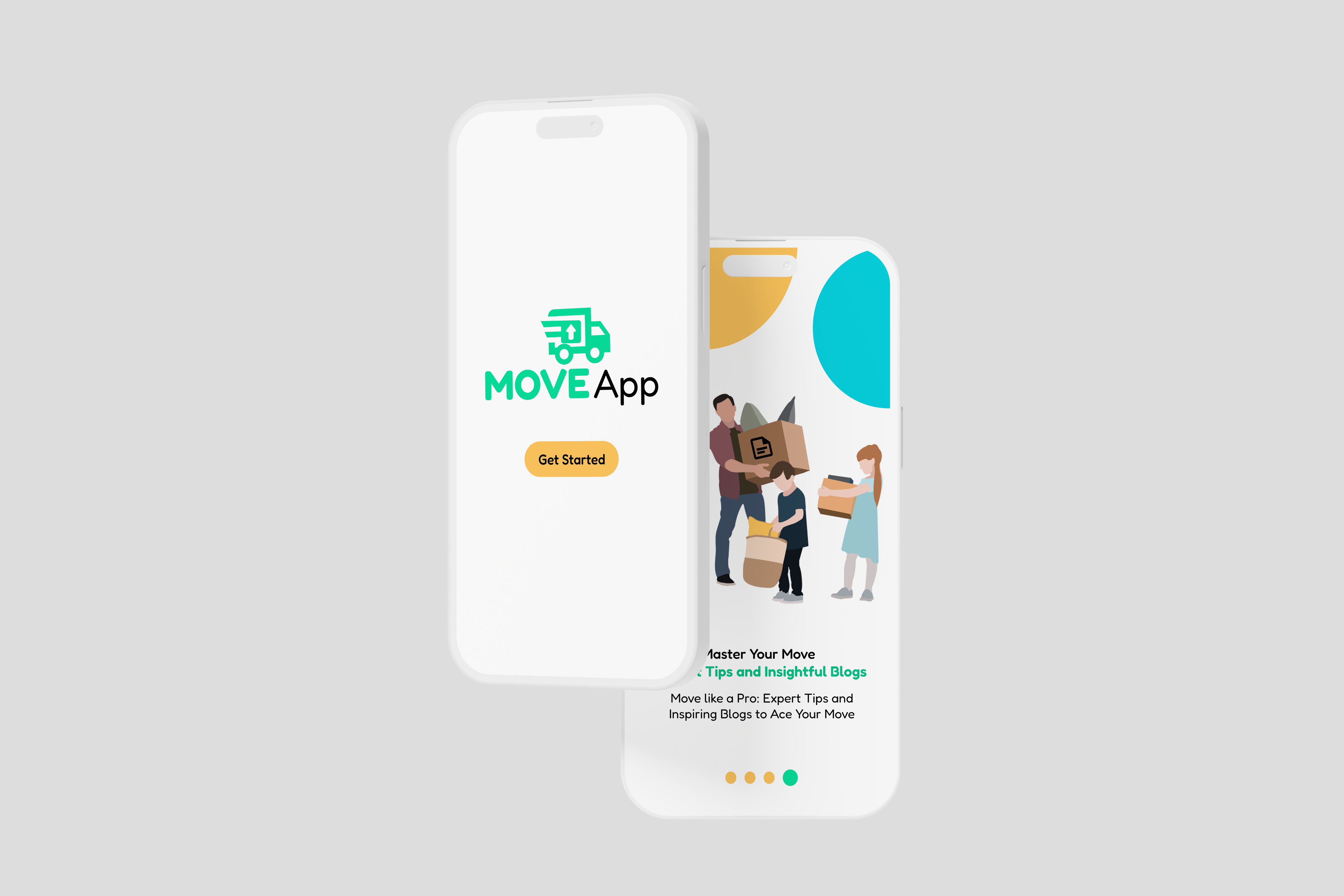
For the visual elements accompanying the MoveApp brand, I illustrated a family holding boxes on their moving day, capturing the excitement and positivity of starting a new chapter. These illustrations were meticulously crafted by me in Adobe Illustrator to align with the app’s overall design language and branding.
then I moved my illustrations to Figma and chose happy, bright colors that complement the green of the logo, creating a cohesive visual experience. These colors are not only visually appealing but also evoke feelings of warmth, optimism, and energy - emotions that are often associated with the anticipation of moving to a new home.
To enhance the sense of approachability, I utilized rounded shapes in the illustrations. The soft, curved lines contribute to a gentle and welcoming design, making the visuals feel more inviting and less formal. This approach ensures that the illustrations resonate well with users, reflecting the supportive and user-centric nature of the app.
By combining these design elements, the illustrations effectively convey the joy and smooth experience that app aims to provide, reinforcing the brand's commitment to making the moving process as pleasant and stress-free as possible.